Monday, June 15, 2009

Furnishing Your Dining Room


Whether you have a separate dining room, a kitchen dining area or even a small dining table at the back of the lounge room, it can be daunting trying to find the right table setting for you. Here are some helpful tips and ideas:

Select a dining table that compliements the shape of your dining area

A square room can be softened by a round table, or given a contemporary look with a square table. Rectangualr tables are great for larger families, people whom entertain often, or acting as a multi-purpose table; extra working space for example.
Mix and match your dining room chairs
Mixing different styles, as long as they are similar in height and colour can add individuality to your dining space.

Leave space
Make sure you leave over a metre for chair pull-back space around your dining table.
Dining area sharing a space?
If your dining area is sharing space with an open-plan kitchen, consider "separating the spaces" with area rugs or a decoartive dividing screen. Lighting can also work well in this situation: use brighter task lighting in the kitchen, and softer ambient lighting in the dining area.

Tuesday, June 2, 2009

Interior Design Style - Create a Modern Kitchen With Concrete Countertops

2009 Interior Design Style - Why Concrete Kitchen Counters Are The Next Big Kitchen Trend


concrete countertop pictures

With the rise of green materials, we see an increased use of concrete in home decorating. Concrete is thought of as a modern material, but it truly dates back to ancient times – the Egyptians mixed lime and gypsum into their version, the Romans used crushed volcanic rock in their construction.

Concrete Kitchen Counters are Both Versitile and Easy to Maintain

Concrete countertops are excellent for residential decorating, to create a unique, personal kitchen style that is durable and easy to care for. Concrete kitchen counters are customized for each job, and can have integral colors, acid stains, or stamped applications. The look is in contrast to the shiny, formal feel of granite, and not as common. Earthy, rich colors are available ranging from deep terra cottas to warm golds, and gray tinged blues or purples.

While concrete countertops do need to be resealed more often, they are not difficult to care for. Because they are a porous material, the concrete may “patina” and incorporate stains or marks as it ages. While this is not desirable to some, it adds to the color and interest in the surface. Stains are not as evident when using colored concrete countertops, though acidic foods can lighten the color. Simply using water will dissipate most stains when acted upon quickly.

Concrete Kitchen Countertops Style For Modern and Traditional Interiors


Installation is key to the success of a concrete kitchen countertop, and not recommended for an inexperienced do-it-yourselfer. The installer will create a template of your kitchen counter layout, and cast the counter top to fit, many times on location. The pigments are mixed into the concrete, creating a style that works with both modern and traditional interiors.

Concrete kitchen countertops have lasting impact and beauty, and will provide an extremely durable surface when cared for properly. Consider this sustainable material for your next kitchen design or bathroom project for an unexpected, attractive addition.

Six Ways to Stretch your Space with Double Duty Furniture

One of my favorite tricks for stretching a space is to use furniture that performs double duty. You’d be surprised how many pieces are manufactured specifically to perform more than one service. You don’t have to limit your choices to new items, though. If you think creatively, you can find multiple ways to give furniture dual purposes. Here’s some of my favorite pieces that offer versatile function and style to your home.

1. Occasional Tables

Occasional tables are well known for their versatile storage options, but they can serve other purposes as well. A lift-top cocktail table can perform multiple jobs. Besides its original purpose as a handy place to set your cup or display your magazines, drawers make it fall into the storage category. When you raise it’s specially hinged top, it comes up and forward to becomes a desk, a game table or a convenient eating place.

Other cocktail tables double as ottomans. I especially like ones that have storage ottomans incorporated in their design. Pull them out, use them for extra seating and neatly hide your knitting or magazines.

End tables can also serve more than one purpose. Choose end tables that feature wine racks or that double as curio cabinets that protect your treasures while still showing them off.


2. Dining Tables

Even if you don’t have a designated dining room, you can create one with multifunctional furniture. Choose sofa tables that expand to seat up to six people or coffee tables that convert into dining tables with just a couple steps. There are stylish wooden folding chairs to coordinate with your table as well. When not in use, just fold the chairs up and hide them away in a closet or under the bed.


3. Kids Furniture

Furniture manufacturers have done a great job coming up with furnishings for kids rooms that play more than one role. There’s all in one nurseries that provide a changing table and dresser space and will grow from infancy to school age with your baby. Loft beds are also great space savers and are available complete with desks, closets and more. Loft bunk beds are a great options for kids who need to double up in one room. Don’t forget to ad a comfy flip chair so there’s someplace for your child to curl up with a book or have a guest spend the night.

4. Sofas and Chairs

Of course, we’re all familiar with sofa beds, but don’t confuse today’s new convertible sofas with grandma’s old hide-a-bed. There really is no comparison in looks or comfort. Today’s innovative furniture designers have created some amazingly comfortable and functional pieces. Do you have nieces and nephews, grandkids or other children that spend the night? There’s even a sofa that can convert to bunk beds.
You can also get sofas or sofa beds that feature storage compartments.

5. Bedroom Furniture

If space is an issue, make your bed do double duty. Instead of just shoving things under the bed, choose a stylish platform bed that offers storage drawers in the platform. You still have a chic look but gain neatly organized storage space at the same time.

There are computer desks that transform into beds and bedroom armoires that function as both clothing storage and a home for your television.

You can even get a bed for your dog that offers extra storage space for Fido’s toys and biscuits.

6. Versatile Accessories


Accessories don’t have to just look pretty. They can contribute function as well as style. Hall trees make a great first impression and offer a place to store boots, hats, umbrellas and other outdoor items, plus a handy place to sit and take off your shoes. Efficient entertainment centers will offer storage for DVDs and books. Baskets are great places to store keys and mail and decorative boxes can be used to stash a variety of items while lending charm and warmth to your space.

Getting the most from your small space while still creating a stylish home is definitely a challenge. With careful shopping and resourceful thinking, though, you can combine fashion and function into a chic and comfortable place your proud to show off.

Remaking a Room with Mirrors

There is something about adding a mirror to room that can make it a good space turn great. It can open up a doorway or make a small space seem larger. A dark corner suddenly resonates with the rest of the room.

Uttermost Trevis Mirror

Once used as more of a focal point in bedrooms and bathrooms, mirror styles are more interesting than ever, with some practically covering up the actual mirror in order to use if for a reflective surface. Chunky ornate frames made from cast resin become artwork themselves. Unusual materials, such as bone or shell add soft colors. Smaller pieces of mirror are applied to the outside of a frame or in unexpected patterns to bounce light around.

Uttermost Raindrops Mirror

Round and square mirrors give smaller areas a break by adding shape and size. “Mirrors give a room an illusion of infinity,” Geoffrey Bradfield, a New York based designer has stated. It’s not even necessary to hang a mirror anymore – it can be leaned on a mantle or on the floor to add extra dimension.

Uttermost Tarkika Mirror

Pieces of mirror are working their way into tiled surfaces, furniture, lighting, and shelving to add a new play of light into a space. The reflective surface also adds a bit of old Hollywood glamour and dresses up an area.

In Feng Shui, it is believed that a mirror reflects something of good value, whether it is a treasured object, a scenic view, or a favorite photograph. The positive effects are thought to be doubled by the reflection.

Top 10 Home Decorating Mistakes to Avoid

We all fall prey to the projects in our home and get too used to our surroundings, and then mistakes start to happen. These are my top ten decorating mistakes that are easily fixable.

1. Hanging draperies too low. What good is a 10’ ceiling if you do things that lower it visually? Window treatments that are outside mounted on the wall need to go as high as possible in almost every instance. Mount the rods or the header right underneath crown molding, or at the point where the wall meets the ceiling. Otherwise, it looks like you cut the rooms off at the knees when the treatment sits directly on top of the window.

2. Hanging artwork too high. This one can be tough if you are 6’7”. There are some judgment calls to make depending on the artwork, but in most cases the horizontal centerline of a picture should be at eye level. This is not particularly helpful advice since people vary in height, but an average-size person should be able to look comfortably at a picture without having to either bend down or look up.

3. Over-lighting an area. I’ve walked into rooms with so many cans that I’ve actually gotten warm from the heat they give off. It’s also not too flattering to those who are in it. While there is not a steadfast rule to how many recessed lights should be installed as it depends on ceiling height, duct work, etc, the main thing is to put all overhead lights on dimmer switches. Depending on the room consider table and floor lighting that adds ambience. Rooms that are under-lit are just as bad – think general lighting, task lighting, accent lighting.

4. Don’t insist on painting a room a defined color without choosing a rug or fabric first. That so called sage green you loved on the chip may not match a single thing, and cause you to burn more time running around town or on the internet than you ever wanted.

5. Hanging the dining table chandelier too high. This one has a rule of thumb, and it is no more than 32” – 38” above the table. The fixture should never obstruct the view of your guests, and the light should never seem glaring. Modern fixtures that do not have a lot of body to them may be hung higher, as will fixtures with down lights. Always put your chandelier on a dimmer switch!

6. One of my biggest peeves are putting too many pairs of things in a room – pair of lamps, pair of sofas, pair of candles – while some duos are not a bad thing, we don’t want the room to start looking like Noah’s ark.

7. Rugs that are too small for the space. Nothing looks worse than a rug that appears like it was left floating in the middle of a pool. Rugs should be large enough that either all of the furniture should sit on top of the rug, or all of the furniture should frame the rug and sit just off of it. Be certain to measure the dimensions of your room first and the rug is large enough that your furniture arrangement can fit easily on top of or framing it without any crowding.

8. This one may be more of a personal preference, but when arranging your furniture, avoid placing large pieces like beds or sofas on the diagonal. It can make too much of a statement be impractical as it takes up too much room and leaves areas of unused space behind it. Having the large pieces flush or parallel to the walls allows for much better use of space with easier access to outlets and traffic flow. However if you must, try the rug on the diagonal to see if it will work.

9. Being too well matched. Break out of your shell and try something unexpected, for crying out loud! While decorators preach that homes need to flow with their color and patterns, it’s still essential to add some pop to break up the perfection. Throw a blue vase into a predominantly yellow room, or use modern art with antique furniture. This is a room that screams to be broken – your home should speak of your personality, not the cover of a catalog.

10. Not using color. Those all white rooms are very serene, but face it - they are boring. With so many robust colors to choose from, there is no excuse to not bring it in. Find a fabric you love, or a favorite piece of artwork and pull colors against it that inspire you.

Out of this World Interior Lighting Design

Unique Interior Lighting Design

As just another example that creative energy knows no boundaries are the incredible and unique light fixtures . Fiber optics combined with hand crafted, sculptural light fixtures. Crafted in London, this can be found all over the world

Softly draped pieces of glass created ethereal, delicate fixtures. The soft lighting created is almost secondary to the unique sculptures. These fixtures evoke images of fantasy or dream-like states, with influences of underwater or ghost-like movement.

Lona Ceiling Mount Light Fixture


The Lona ceiling mount fixture features petals of white bone china with a halogen capsule. The petals cascade in long flowing strings to resemble a rosebud formation. The ceiling reflection must have a magnificent effect of soft waves and angelic lighting.

The Marni Wall Panel

By contrast, the Marni Wall Panel appears with a fiery woven copper flora shape. Fiber optics are encased with a rich brushed copper surround that would create an ambience of fire. Other finishes are available upon request. This elegant panel would be at home as a wall divider or fireplace substitute. The beauty of these products is that the uses seem limitless.

The Lily Table


Straying from traditional lighting is the Lily Table. Individual ceramic forms are inset into a black frame creating shadow and spaces amidst the blooming optic filament. Covered by a glass top and brushed steel surround, this unusual piece could almost stand on its own.

Create a Truely Unique Interior with Designs

The unique fixtures have been featured in museums, hotels, theatres, and restaurants as well as personal residences. Each piece is custom created individually for its purpose, making each an individual work of art.

Home Decorating Trends: Smaller Space Living

Decorating A Small Space

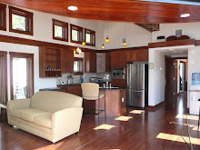
The days of the McMansion are waning, with many people downsizing for simpler living. Baby Boomers, young professionals, and grad students are now considering the benefits of city living in loft-like settings. Most of these buildings are located in the heart of a city, close to work, cultural activities and basic amenities. They range from apartments converted to condo living to old warehouses rehabbed into lofts. What is becoming a desirable trait is that the spaces are small – 2000 square feet or less in many cases.

Why would this be an option if you’ve lived in a 4,000 square foot home with a yard? For some people, it takes the pressure off of having to take care of all that space, as well as deal with lawns or snow removal. Most cities have codes that require underground parking spaces, or have adjacent lots to the building with spaces available, making parking convenient. For some people, the idea of getting rid of “stuff” they’ve accumulated is refreshing.

It can be a shock to walk into a smaller unit for the first time if you are downsizing. The kitchens are typically very modest, with storage at a minimum. Creative storage solutions are necessary, with built-ins doing double duty as service pieces. Some of the loft units are open floor plans that allow you to place the walls where you want, with plumbing being your only constraints.

Seating areas need to be better thought out and ready for multiple functions. For instance, a kitchen island does not have to be stationary – it could have leaves or hidden fold out legs that convert it to a dining table-like piece to seat ten. Sofas double as beds in one bedroom units, and family rooms incorporate home offices.

When downsizing, particularly after living in a house for a majority of years, it may be best to bring an interior designer in to help you make the right choices. A designer will access your existing needs and find creative storage options. A long living room wall is the perfect place to consider built-ins that offer open shelves as well as hidden storage behind doors and drawers. While the television may be stationed in the center, all your dishes and little used cookware may be stored underneath.

Beds can be converted to platforms that sit on top of drawers for extra storage. Closet systems are important to provide maximum shelf and hanging storage. Laundry is often combined into a bathroom behind doors, and the use of stackable units saves more space.

Downsizing does not have to be a scary idea, but it does take careful consideration before you make the leap. Small space living has its own rules for home decorating that allow for simple tighter pieces that don’t have to look too minimal. Consider the pieces you already own to see if they still work. Once you have the mindset that this style is right for you, getting rid of the excess is easy.